
PROJECT OVERVIEW

The Product
A botanical florist platform that offers dried flora and plants in the form of bouquets, wreaths, and single do-it-yourself stems. They also offer monthly subscriptions.

Project Duration
8 weeks: October 15 - December 15, 2023

The Problem
Users seek access to floral purchases via apps and websites, seldom going into storefront florists. Users also enjoy taking advantage of the ease and immediacy of online access.

The Goal
To offer users an accessible, inspiring, and intuitive platform where they can browse and purchase dried botanical products.


My Role
This was an individual project for the Google UX Design Certificate through Coursera. It was an opportunity to plan and direct each step of the design thinking process as a UX student with mobile and web UI design experience.
Responsibilities
-
Conduct User Research
-
Define the problem and provide insights to inform the ideation phase
-
Define personas, user journeys, empathy maps, and user flows
-
Visual design of low-fi and high-fi wireframes, prototypes, and user testing
UNDERSTANDING THE USER
-
User Research
-
Personas
-
Problem Statements
-
User Journey Maps

USER RESEARCH
To understand user frustrations, needs, and requirements, I conducted user research through interviews. Due to a time constraint, I chose qualitative research. In order to better design my app and responsive website, my goal was to gain insight into the desires and processes users go through in seeking florals.

PAIN POINTS
Time
1
Working adults are too busy to find time to stop in at a flower shop in person
2
Price
Users may desire flowers, but don't want to spend money on flowers that quickly die
3
Stress
In our stressful modern lifestyle, users seek ways to beautify their surroundings to help them destress


THE
DESIGN
PROCESS
-
Paper Sitemap
-
Paper Wireframes
-
Digital Wireframes
-
Low-fidelity Prototype
-
Usability Studies

PAPER SITEMAP
I built user-focused flows to ensure that my personas will be able to successfully complete their key objectives while reducing their pain points.

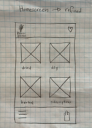
PAPER WIREFRAMES
Focusing on the core features identified during the user research, with an emphasis on structure and ease, I sketched the initial wireframes using pencil on graph paper.


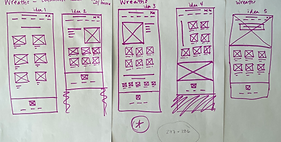
PAPER WIREFRAMES
I drafted iterations of each screen on paper to start the work on designs for additional screen sizes, making sure the site would be fully responsive.
Screen size variations


DIGITAL WIREFRAMES
The paper wireframes became digital wireframes. After several iterations, these are the wireframes that best met user needs and offered an intuitive user flow.
Simple, streamlined navigation from images with titles and prices below each item


SCREEN SIZE VARIATIONS
I worked on digital wireframes for additional screen sizes to make sure the site would be fully responsive.


Mobile
Desktop
LOW-FIDELITY PROTOTYPE
I created a low-fidelity prototype from the user flow diagram and wireframes to test functionality before incorporating it into the final design and to ensure accessibility for end users.

USABILITY STUDY PARAMETERS

Study Type
Moderated usability study

Location
United States

Participants
3 participants
Length

15-20 minutes
USABILITY STUDY FINDINGS
Contrast
1
The font contrast and size on the confirmation page was hard to read.
2
Categories
The categories were confusing at the start. User wasn't sure where to click.
3
Cart
There was no option to delete an item once it is in the cart.
REFINING THE
DESIGN
-
Sticker Sheet
-
Mockups
-
High-fidelity Prototype
-
Accessibility
STICKER SHEET
The sticker sheet ensures consistency throughout the design, as well as easy access to the logo, colors, typography, icons, and buttons of the brand.

MOCKUPS
Based on insights from the usability study, I applied design changes such as increasing the contrast between the font and the background.
Before Usability Study
After Usability Study


Original Screen Size

Screen Size Variation


ACCESSIBILITY CONSIDERATIONS
1
I implemented a text hierarchy throughout the app and website. This helps users and screen readers to distinguish the different sections and information on the screen.
2
I am using only two typefaces: Jacques Francois for headlines and Inter for body copy. Mixing too many different typefaces can make your app or website seem fragmented and busy.
3
I used icons and text to indicate calls to actions and in the menu of the app. This act as a signpost and reduces ambiguity.
TAKEAWAYS
Impact

The purpose of this app and website is to provide accessiblity to users desiring florals and botanicals. My design strategy was to enhance and streamline engagement with the application and website.

What I learned
The biggest takeaway from this project was learning how very much I enjoy UX design. I saw first hand how a design evolves over time and iterations. I learned the value of research and usability studies in understanding the lens and needs of a user. Lastly, I learned how lovely dried flowers can be!
.jpg)
NEXT
STEPS
1
Obtain UX / UI feedback from designers with more experience in the field to improve the overall design and functionality.
2
When I have documented all feedback that was provided, I will make the necessary deign updates in order to improve the app’s overall experience.
3
Create a cross-platform responsive design. The goal is to build the same experience for all users, no matter what type of device they are using.
